

RAY APPLICATIONS
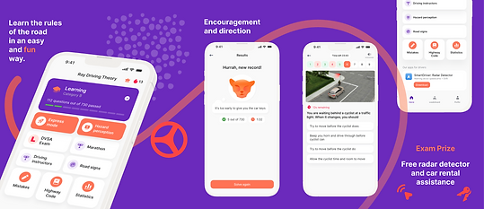
A brand of digital products for drivers and car owners is present in the markets of France, the UK, Germany, Poland, and Russia. It includes tests for preparing for driving exams, an administrative hub with the ability to pay fines and purchase insurance, as well as an app with bonuses and discounts on automotive products based on driving skill assessments.


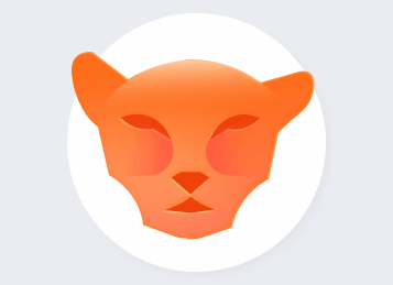
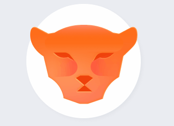
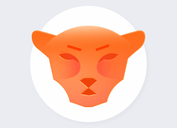
The basis of communication with users became the mascot — a cheetah named RAY, appearing in identity elements starting with the dynamic logo.
The ‘tail’ element sets the tone for each specific situation where the logo is used and also appears as an independent element outside of the font part of the logo.
Typography is represented by a font pair — an expressive display headline font and a standard body font from the Google library.


The color palette and graphics are active and friendly. They are designed to relieve stress for beginner drivers.


The photo style features a rich, warm color scheme with backlighting, conveying a cozy atmosphere of both the city lights and a friendly campfire by the ocean — all the possibilities that come with having a car in one’s life.


The product is digital, which means maximum attention was given to the elements of the applications.
The icons represent a unified system that includes different language versions of the logo.

A new visual system was developed for the app screens in accordance with the new identity.
The app store covers retained the functional elements that performed best across different countries while being branded as a unified product system.


Offline media - from advertising on urban transport to business cards.

Social media - The basis of communication with users. The templates use all elements of identity.

Social media - The basis of communication with users. The templates use all elements of identity.


Specific graphic elements were developed for each product - Reflecting its functionality, while fitting into the general branding system.


Creative group:
Identity, art direction - Natalia Grebenshchikova
UX/UI application design - Andrey Pushkarenko